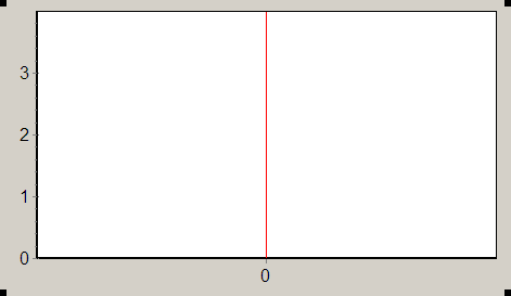
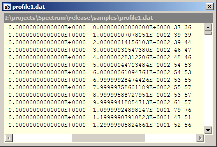
For example let’s consider the file profile1.dat located in directory <Spectrum installation directory>\samples\. If we’ll plot this file by the function Add From File we’ll only see straight vertical line: Looking into this file with help of any text editor or with help of the command Open in Open in Buit-in Viewer we can see such text: It is table file that contains data in more than two columns of values. By default Spectrum takes values from the first and the second columns
and treats them as X and Y values respectively. In this file all values in the
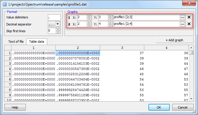
first column are zero, so graph looks like vertical line rising at X = 0. To make true graph we should use the functions Add From Table.
Leave the first column aside and take the second column as X values.
Y values for the first graph can be taken from column 3. Use the button “+ Add graph” to define another graph and assign
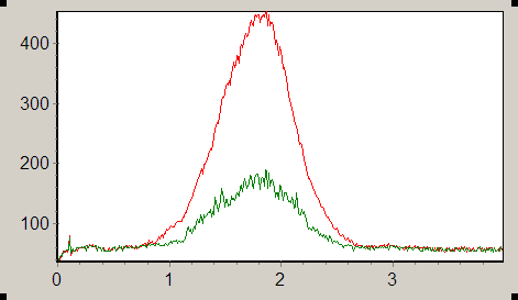
the second column to be its X values too and the column 4 to be Y values. As a result we have two new graphs on the diagram: | 
)
)
)